Thursday, December 8, 2011

Visual Techniques

simplicty
unity
stasis
singularity


boldness
complexity
activeness
randomness
episodic
variation


These are both of my absolute favorite brand identities. The first one was created by Wolff Olins for the Join Red campaign. It is very simple in its design because it is just type. It's static because when it is applied, it is very flat and creates no movement. All that is added are the parenthesis and the suffix "red." Because of its simplicity, the application of the Join Red brand into different brands, such as Gap, Starbucks, Beats By Dre, etc, are all very unified. It has that distinct red and the parenthesis and suffix. It is so simple, yet impactful.

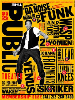
Very different from the first example is my favorite use of typography in branding created by Paula Scher of Pentagram for the Public Theater in New York. Using strictly type, she managed to create active movement through complex composition. Within just one word, there are a variation of sizes. The use of color and overall design is very bold. The composition also seems random in the placement of type. It is absolutely beautiful chaos.
Thursday, December 1, 2011

Contrast

SUCCESS
This movie poster is successful in its contrast of typography. It creates a very logical hierarchy of importance. The most obvious typographic element of importance is the title, "PERFUME" which is set in all caps and is much larger in contrast to all the other text on the poster. The next important element is the secondary title. In relation to "PERFUME," the contrast is incredibly noticeable in the size. It is still set in all caps, but in relation to the production text on the bottom of the poster, it still appears to be much more noticeable whereas, the production text becomes a grey box due to the amount of text that is there and the small size. There are also contrasts in typefaces between the two titles and the production text. Another great thing about this poster is that it is mainly black and white with the bright red rose pedals that give the photographic element of this poster great contrast in color as well.


FAILURE
This is also a movie poster, except it is poorly designed. In regards to typography, the names and the yellow text are exactly the same typeface and size creating no form of hierarchy. The contrast between typefaces of the names and the title, "THE APARTMENT," exists, however the sizes are so similar and the placement is so odd that it gets lost in the chaos of text. The color choices create contrasts, but the yellow is the most noticeable color because it is used on a large piece of text and only shows up once in the entire poster. The problem is it highlights the recommendation for this movie instead of the title itself.

Thursday, November 17, 2011

Movement & Motion

Logos tend to imply movement. Often they can be implied through stills and/or have versions where the movement is shown to create the still logo. For example, Malabar Studio Creativo is a still logo, but still implies movement. The bottles that are in different colors imply a circular motion using the technique of overlapping. The way they overlap in a circular manner create depth as well. The motion it creates starts from the yellow bottle and move clockwise towards the green bottle placed in the front of the rest of the bottles. It creates a continuous movement and if animated, can easily be imagined to move as such. As simple as the logo is, it succeeded in creating interest through implied motion. It is not at all static and the different hues used to overlap each other create somewhat of a gradient effect that helps to imply the movement as well.


Infographics often imply motion through the way it is designed to guide the viewers' eyes like a map. This infographic in particular implies movement in the same way using a couple techniques. There is depth in the infographic that creates a staircase effect. The depth implies motion that as you move from left to right, you gradually move up in dimension. The shadows used to the left of each section adds to the depth and dimension of the staircases. Another technique implemented for movement adds to the staircase effect through relative size. Adding to the depth, the size of the bars get larger as it moves to the right implying that the bars on the right are closer to me than the bars on the left. The implied motion in this infographic is the staircase effect created where an imagine person could literally walk from the left side and gradually get closer as they move to the right, being that it is from the top view.

Thursday, November 10, 2011

Dimension/Depth/Space/Scale


This is a poster for the Toy Story 3 movie. This is an excellent example of depth and dimension because the characters in relation to the room show how there is a vanishing point behind them because everything implies a movement further into the room. The scale of the characters begin to decrease as each one is aludes to move behind each other. All of the shadows and highlights also add dimension to the objects in the poster. It creates a 3D space within a 2 dimensional poster and movie. Throughout the movie, they treat dimension and depth very well with the utilization of scale. In terms of the space, the windows in the background have perfectly vertical and horizontal lines to indicate the back wall or the back end of the space. This shows that they are definitely within the walls of a room and it contains the subjects of the picture within it, whether it is Woody all the way in the front, or the toys stacked on top of the shelves.

Thursday, November 3, 2011

Week 10: Tone and Color

http://www.intobrazil.net/

The tone and color of the background image used for this site provides warm and relaxing atmosphere without distracting the foreground objects. The background image is reduced to a golden color that has been darkened and desaturated so that all the tonal colors would show. The brightest tone is the sun, which made the subjects, the people, silhouettes. The mountains and the ocean tones adds a relaxing vibe of Brazil through the different shadows they create and the depth it adds to the photo. Meanwhile, the foreground has really bright photos that depict Brazil in the same way, but using brighter colors and tones. The color used as the websites main color are different hues of green. It contrasts from the golden background, but doesn't clash in brightness because the background is of a darker tone while the green hues that are used are more bold and bright. There are many transparencies used in this website that add different tones to the background. For example, when you do a mouseover over the words "explore" or "your way," a transparent black strip appears. The fact that objects are moved to show more of the background image and a black strip appears in front of the background image makes the image appear brighter in tone and more golden in color. I have also noticed that the color and tones of the buttons on the bottom of the home page indicating the different places in Brazil to visit are harder to read than some of the other buttons. The green that it was placed against seems to light and is harder to read the white letters against it. It works better with the logo on the the left corner because it is against the darker shade of green.

Wednesday, October 26, 2011

Dondis Basic Elements - Web Design

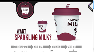
SCALE: http://www.sparklingmilk.com/
Sparkling Milk does a really good job emulating scale in their web design. The way the cups and the words are arranged, it looks as if "want" and the smaller cup are in the distance because of the use of scale. They also add a blur over the word and the pictures to create a depth of field. They utilize that blur to imitate shallow depth of field similar to photography. The size of the larger cup relative to the smaller cup differs in scale that the illusion it leaves us with is depth.


COLOR: http://thisispopa.com/
Red is a primary color and having this website mainly in such a candy red calls out for attention. The contrast they use by choosing black and white as their secondary colors for the sight keep the site readable and simple enough that the colors do not clash with each other, but instead, complement the bright red. Red is a very attention grabbing color that serves a good purpose for this website because they are advertising a product that I'm sure the company wants a great deal of attention for.

MOVEMENT: http://themeforest.net/item/studio8-a-creative-minimalist-wordpress-theme/full_screen_preview/691657
This is a theme that can be applied to a wordpress site. The gives the implication of movement because the photo they use stretches throughout the entire page and the photo itself implies movement. The shot of the man throwing his head back implies some sort of spinning or body movement as if it was a still shot from a film. Not only does this site imply movement, but it contains 5 different full bleed photos that act as a slideshow that slides in from the right. The slideshow action buttons have arrows that imply movement will happen when those buttons are clicked which does its job because its implied movement actually shows the next slide coming in from the right.

Thursday, October 20, 2011

Visual Thinking Research

The two puzzles I chose were "Block Twins" and "Next Square."

My Attempts:

I thought it would be 'D' because I thought that the pattern involved squares 1 and 3 to be combined to make the 4th square, so I combined 2 and 4 to make the 5th square.

These were the only pairs I could find. I was counting the blocks and rotating the paper to see if they matched. After looking at the answers, I was surprised to find out that I only chose one correct pair.


My Brother's Attempts:
My brother said he was using the process of elimination and ruling out the possible answers and none of them seemed to match so he chose 'D' because it was the only one that made any kind of sense to him.

My brother only found these two pairs. He said he didn't really have a strategy and that he just tried matching the ones that looked the most similar.