simplicty
unity
stasis
singularity
complexity
activeness
randomness
episodic
variation
These are both of my absolute favorite brand identities. The first one was created by Wolff Olins for the Join Red campaign. It is very simple in its design because it is just type. It's static because when it is applied, it is very flat and creates no movement. All that is added are the parenthesis and the suffix "red." Because of its simplicity, the application of the Join Red brand into different brands, such as Gap, Starbucks, Beats By Dre, etc, are all very unified. It has that distinct red and the parenthesis and suffix. It is so simple, yet impactful.
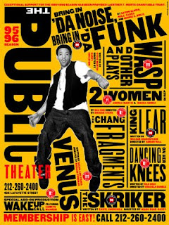
Very different from the first example is my favorite use of typography in branding created by Paula Scher of Pentagram for the Public Theater in New York. Using strictly type, she managed to create active movement through complex composition. Within just one word, there are a variation of sizes. The use of color and overall design is very bold. The composition also seems random in the placement of type. It is absolutely beautiful chaos.

No comments:
Post a Comment